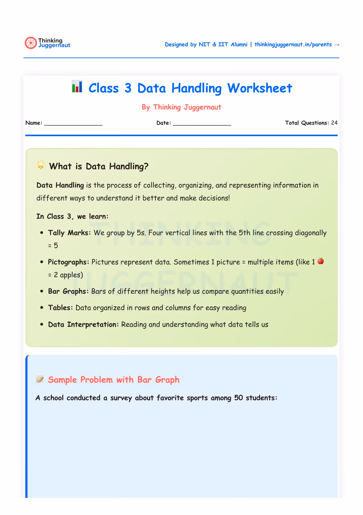
Master data handling for Class 3 with our worksheet. Includes scaled pictographs, bar graphs, and data interpretation. Includes solved examples and practice questions to help your child analyse and compare real-world data.
Data Handling is the process of collecting, organising, and representing information so we can understand it better and make decisions. In Class 3, we move beyond simple counting. We learn to read scaled pictographs where one symbol represents more than one item, interpret bar graphs using a Y-axis scale, and analyse data to find patterns, totals, and differences.
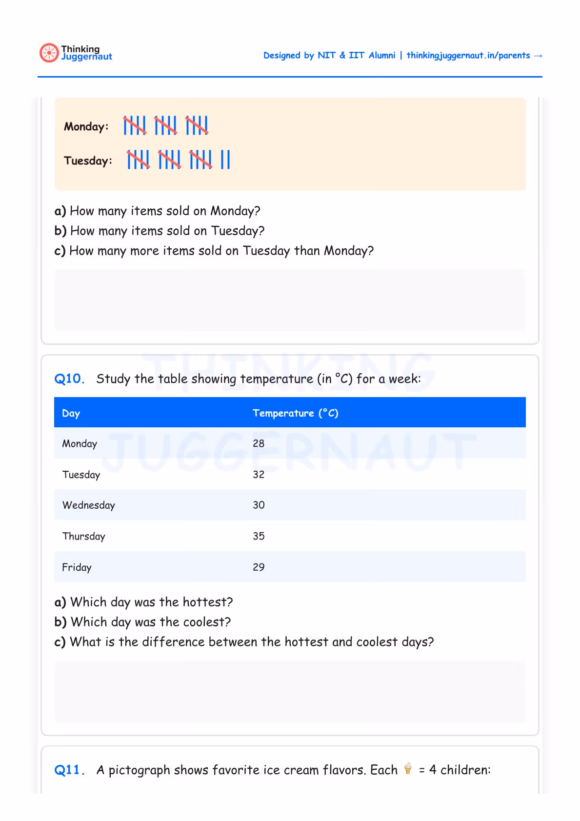
Tally Marks: Numbers recorded as vertical lines, grouped in fives with a diagonal cross. Used for counting raw data before it is organised into tables or graphs.
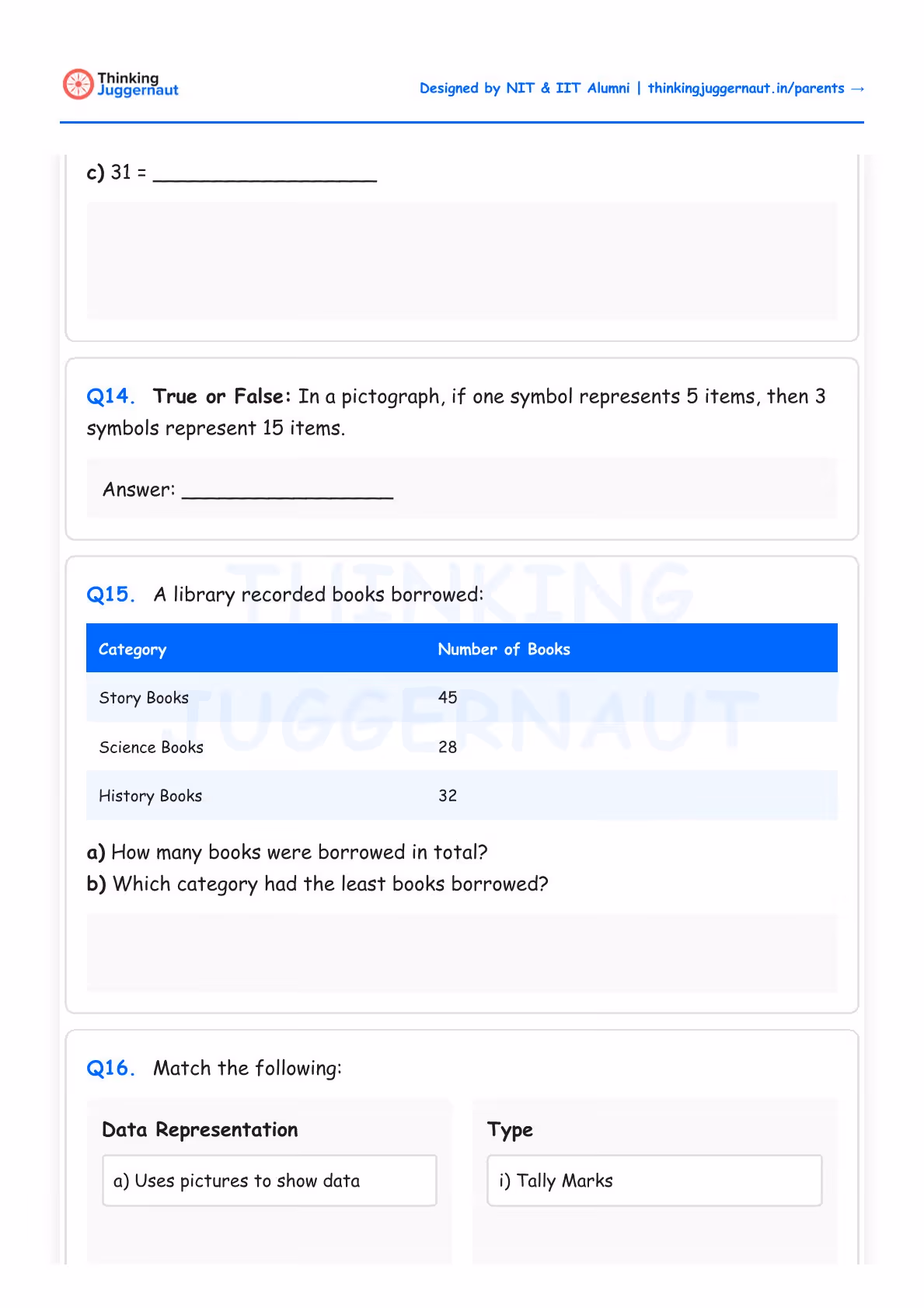
Pictographs: Pictures or symbols represent data, where one symbol can equal multiple items. The key (or legend) tells you what one symbol is worth. Always read it first.
Bar Graphs: Rectangular bars of different heights compared against a Y-axis scale. The height of the bar is meaningless without understanding what the scale represents.
Data Interpretation: Reading data is not enough. We now ask deeper questions — which is the most, which is the least, what is the difference, and what is the total.
A school surveyed 50 students about their favourite sports. The bar graph shows: Cricket (18), Football (12), Badminton (15), Swimming (5).
First, check the Y-axis scale to understand what each unit represents. Then read the height of each bar to find the value. Cricket has the tallest bar at 18 students, making it the most popular. Swimming has the shortest bar at 5 students, making it the least popular. To find the total, add all values: 18 + 12 + 15 + 5 = 50. To find the difference between Cricket and Football: 18 − 12 = 6 students.
Reading graphs on a worksheet is one skill. Deciding what to measure, collecting the data, organising it, and presenting it — that is the full cycle NEP-2020 envisions for Class 3 data handling.
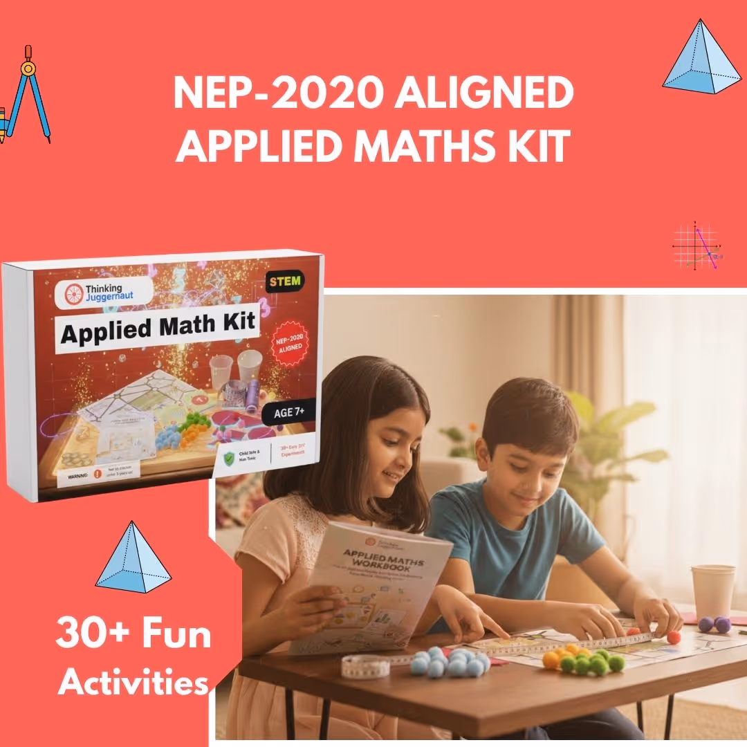
The Applied Maths Project Kit by Thinking Juggernaut includes hands-on activities where children gather real measurements — distances, quantities, comparisons — and organise them to solve actual problems.
Always check the key – In scaled pictographs, one symbol can represent many items. Reading the key first prevents counting errors.
Master the Y-axis – Before reading a bar graph, understand what the scale represents. This is where most mistakes happen.
Think beyond counting – Class 3 data handling asks you to find totals, differences, and make comparisons. Practice these three operations with every graph or table you see.
Collect real data – Track something at home like daily screen time, meals eaten, or birds spotted. Organise it into a table, then turn it into a bar graph.
Use graph paper for accuracy – When drawing bar graphs, graph paper keeps bars neat and aligned to the scale.
Compare across categories – Practice spotting which value is the highest, which is the lowest, and which changed the most over time.
Download the complete worksheet here. The PDF includes all 24 questions across 3 difficulty levels, visual bar graphs and pictographs, a draw-your-own graph question, and a full answer key with working shown for all multi-step interpretation problems.
What is data handling in Class 3 maths?
Data handling in Class 3 covers four ways of recording and representing information: tally marks, tables, pictographs, and bar graphs. The key progression from Class 2 is that pictographs now use a scale where one symbol represents more than one item, and bar graphs now have a Y-axis with a numeric scale. Children are expected not just to read data but to interpret it — finding totals, differences, and making comparisons across categories.
What is the difference between a pictograph and a bar graph?
A pictograph uses symbols or pictures to represent data, where each symbol has a value defined by a key — for example, one apple symbol equals 5 kg of fruit. A bar graph uses rectangular bars of different heights measured against a numeric Y-axis scale. Pictographs are easier to read at a glance; bar graphs are more precise for exact values and comparisons. Both appear in the Class 3 syllabus, and this worksheet covers both in all three difficulty levels.
Why is scaled pictograph reading difficult for Class 3 students?
In Class 2, one symbol in a pictograph typically equals one item. In Class 3, one symbol can equal 2, 3, 4, 5, or more items depending on the key. Children who haven't yet automatised the habit of checking the key first will count symbols and report the wrong answer. The fix is simple but requires repeated practice: read the key before counting anything. Part A of this worksheet specifically builds this habit before the scale values increase in Parts B and C.
What data interpretation skills are tested in Class 3?
Class 3 data interpretation asks children to identify the maximum and minimum values in a dataset, calculate totals by adding all values, find differences between two categories, compare values across time periods or categories, and convert between representations (tally marks to table, table to pictograph). All six of these skills appear in this worksheet, with the more complex ones — multi-variable comparison and cross-time analysis — reserved for Part C.
Is this worksheet suitable for CBSE Class 3 students?
Yes. The content aligns with the Class 3 maths syllabus followed by CBSE and most boards. Tally marks, pictographs with scale, bar graphs, and data tables are all within the prescribed curriculum. The inclusion of draw-your-own graph questions in Part C also prepares children for the practical components of school assessments.
How long should this worksheet take to complete?
Part A takes 15–20 minutes. Part B takes 20–25 minutes given the multi-part interpretation questions. Part C includes drawing a bar graph and interpreting a multi-day multi-variable pictograph, so allow 20–25 minutes. Total: 55–70 minutes. This is the most time-intensive worksheet in the Class 3 series — it can comfortably be split across two sessions, with Part C completed separately.
Worksheets build practice. The Applied Maths Project Kit builds understanding — 30 real-world math activities covering the same concepts your child is practising here, from multiplication and grouping to measurement and data.
Designed by IIT & NIT Alumni · NEP-2020 aligned · Trusted by parents across India
Class 3 Multiplication Word Problems
Class 3 Division Word Problems
Not in Class 3?
Visit our Main Math Worksheet Hub to explore all printable worksheets from Class 2 to Class 8.
Almost there!
We will confirm your order on WhatsApp
Order placed!
Thank you! You will receive a WhatsApp confirmation shortly.